We Got Ya Covered (Well…)
![]()
The Writing Cave has lately also been a Design Cavern, as we try to get a jump on cover ideas for our next series. It’s as important not to rush the creative process for a visual product as it is for prose, and you deserve beautiful covers to look at. We won’t let you down.
Our preliminary brainstorming has given us several intriguing concepts, plus several lightboxes and pinboards full of images. It’s really, unbelievably easy to burn whole afternoons on image research.
We’ve thrown together a few mockups, nothing too fancy at this stage. Jen has collaged some rough comps in Photoshop, while Kent fills pages with hand-lettered variations of the titles like he’s daydreaming about marrying them.
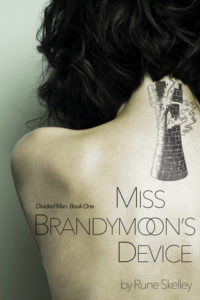
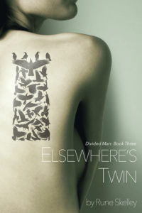
The biggest challenge is coming up with unifying imagery for all three books. That’s not quite the whole problem, though. The three books form one large story, and there are ideas at both a micro and macro level that tie everything together. We easily made a short list of relevant symbols. What we want is for each book to have a distinctive main image, and all three of those images to work as a set that exemplifies the theme. (And expresses the appropriate mood, and conveys an accurate impression of the genre, all while looking awesome.)
It’s a tall order. But we didn’t let you down last time.


